Quatum states of Carbon Monoxide and Fortrat Diagram
We here see the quantum states of Carbon Monoxide. Also, to see how the band head appears, we would like to plot the Fortrat diagram with a given quantum number and interval. To do so, we use optional_quantum_states=True option inMdbExomol.
from exojax.database.exomol.api import MdbExomol
emf='CO/12C-16O/Li2015'
mdb =MdbExomol(emf, None, optional_quantum_states=True)
/home/kawahara/exojax/src/exojax/utils/molname.py:197: FutureWarning: e2s will be replaced to exact_molname_exomol_to_simple_molname.
  warnings.warn(
/home/kawahara/exojax/src/exojax/utils/molname.py:91: FutureWarning: exojax.utils.molname.exact_molname_exomol_to_simple_molname will be replaced to radis.api.exomolapi.exact_molname_exomol_to_simple_molname.
  warnings.warn(
/home/kawahara/exojax/src/exojax/utils/molname.py:91: FutureWarning: exojax.utils.molname.exact_molname_exomol_to_simple_molname will be replaced to radis.api.exomolapi.exact_molname_exomol_to_simple_molname.
  warnings.warn(
/home/kawahara/exojax/src/exojax/spec/api.py:233: UserWarning: nurange=None. Nonactive mode.
  warnings.warn("nurange=None. Nonactive mode.", UserWarning)
HITRAN exact name= (12C)(16O)
radis engine =  vaex
             => Downloading from http://www.exomol.com/db/CO/12C-16O/Li2015/12C-16O__Li2015.def
             => Downloading from http://www.exomol.com/db/CO/12C-16O/Li2015/12C-16O__Li2015.pf
             => Downloading from http://www.exomol.com/db/CO/12C-16O/Li2015/12C-16O__Li2015.states.bz2
             => Downloading from http://www.exomol.com/db/CO/12C-16O/12C-16O__H2.broad
             => Downloading from http://www.exomol.com/db/CO/12C-16O/12C-16O__He.broad
             => Downloading from http://www.exomol.com/db/CO/12C-16O/12C-16O__air.broad
Note: Caching states data to the vaex format. After the second time, it will become much faster.
Molecule:  CO
Isotopologue:  12C-16O
Background atmosphere:  H2
ExoMol database:  None
Local folder:  CO/12C-16O/Li2015
Transition files:
     => File 12C-16O__Li2015.trans
             => Downloading from http://www.exomol.com/db/CO/12C-16O/Li2015/12C-16O__Li2015.trans.bz2
             => Caching the .trans.bz2 file to the vaex (.h5) format. After the second time, it will become much faster.
             => You can deleted the 'trans.bz2' file by hand.
DataFrame (self.df) available.
Check DataFrame. We see Li2015 contains the vibrational states for lower and upper states, v_l, v_u.
mdb.df[0:2]
| # | i_upper | i_lower | A | nu_lines | gup | jlower | jupper | elower | v_l | v_u | kp_l | kp_u | Sij0 |
|---|---|---|---|---|---|---|---|---|---|---|---|---|---|
| 0 | 84 | 42 | 1.155e-06 | 2.40559 | 3 | 0 | 1 | 66960.7 | 41 | 41 | e | e | 3.81197e-164 |
| 1 | 83 | 41 | 1.161e-06 | 2.44177 | 3 | 0 | 1 | 65819.9 | 40 | 40 | e | e | 9.66303e-162 |
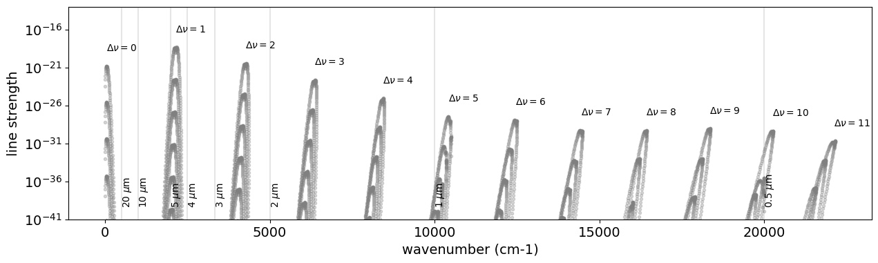
The Rovib transition changes both rotational and vibrational quantum states. We here investigate the vibrational quantum state \(\nu\). Let’s check how many \(\Delta \nu\) Li2015 database contains:
import numpy as np
dv = mdb.df["v_u"]-mdb.df["v_l"]
np.unique(dv.values)
array([ 0, 1, 2, 3, 4, 5, 6, 7, 8, 9, 10, 11])
So, we have 12 different \(\Delta \nu\). Let’s plot them.
import matplotlib.pyplot as plt

fig = plt.figure(figsize=(15, 4))
ax = fig.add_subplot(111)
for i, udv in enumerate(np.unique(dv.values)):
    mask = dv == udv
    mdf = mdb.df[mask]
    ax.plot(
        mdf["nu_lines"].values,
        mdf["Sij0"].values,
        ".",
        alpha=0.3,
        color="gray",
    )
    ax.text(
        np.sum(mdf["nu_lines"].values * mdf["Sij0"].values)
        / np.sum(mdf["Sij0"].values),
        1.0e2 * np.max(mdf["Sij0"].values),
        "$\\Delta \\nu=$" + str(udv),
    )

for mic in [0.5, 1, 2, 3, 4, 5, 10, 20]:
    x = 1.0e4 / mic
    plt.axvline(x, alpha=0.2, color="gray")
    plt.text(x, 1.0e-39, str(mic) + " $\\mu$m", rotation="vertical")
plt.yscale("log")
plt.ylim(1.0e-41, 1.0e-13)
plt.tick_params(labelsize=14)
plt.xlabel("wavenumber (cm-1)", fontsize=14)
plt.ylabel("line strength", fontsize=14)
plt.savefig("co_dnu.png", bbox_inches="tight", pad_inches=0.1)
plt.show()
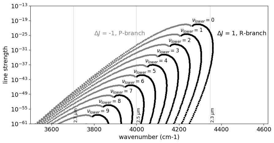
Let’s go deeper! Expand this for \(\Delta \nu=2\) (K-band feature).
dv = mdb.df["v_u"] - mdb.df["v_l"]
dJ = mdb.df["jupper"] - mdb.df["jlower"]

fig = plt.figure(figsize=(10, 5))
for i, vl in enumerate(np.unique(mdb.df["v_l"].values)):
    mask = (dv == 2) * (dJ == 1) * (mdb.df["v_l"] == vl)
    vdf = mdb.df[mask]
    plt.plot(vdf["nu_lines"].values, vdf["Sij0"].values, ".", color="black")
    if i < 10:
        plt.text(
            np.nanmean(vdf["nu_lines"].values),
            8 * np.nanmax(vdf["Sij0"].values),
            "$\\nu_{lower}=$" + str(vl),
            fontsize=12,
        )
    mask = (dv == 2) * (dJ == -1) * (mdb.df["v_l"] == vl)
    vdf = mdb.df[mask]
    plt.plot(vdf["nu_lines"].values, vdf["Sij0"].values, ".", color="gray")

for mic in [2.3, 2.5, 2.7]:
    x = 1.0e4 / mic
    plt.axvline(x, alpha=0.2, color="gray")
    plt.text(x, 1.0e-60, str(mic) + " $\\mu$m", rotation="vertical")

plt.text(3800.0, 1.0e-25, "$\\Delta J$ = -1, P-branch", color="gray", fontsize=14)
plt.text(4380.0, 1.0e-25, "$\\Delta J$ = 1, R-branch", color="black", fontsize=14)
plt.yscale("log")
plt.ylim(1.0e-61, 1.0e-13)
plt.xlim(3500, 4620)
plt.tick_params(labelsize=14)
plt.xlabel("wavenumber (cm-1)", fontsize=14)
plt.ylabel("line strength", fontsize=14)
plt.savefig("co_dnu_expand.png", bbox_inches="tight", pad_inches=0.1)
plt.show()
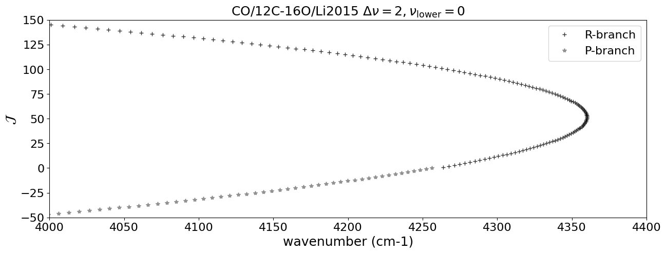
Using DataFrame, we pick up the lines with \(\Delta \nu = 2\), \(\Delta J = \pm 1\) (R, P-branch), and \(\nu = 0\) here.
dv = mdb.df["v_u"]-mdb.df["v_l"]
dJ = mdb.df["jupper"] - mdb.df["jlower"]
vmask = mdb.df["v_l"] == 0
mask_R = (dv == 2) * (dJ == 1) * vmask
mask_P = (dv == 2) * (dJ == -1) * vmask

df_R = mdb.df[mask_R]
df_P = mdb.df[mask_P]
Let’s plot the Fortrat diagram. The y-axis of the Fortart diagram is \(J_\mathrm{upper}\) for R-branch and \(- J_\mathrm{lower}\) for P-branch.
import matplotlib.pyplot as plt
fig = plt.figure(figsize=(15,5))
plt.plot(df_R["nu_lines"].values,df_R["jupper"].values,"+",alpha=0.8, color="black",label="R-branch")
plt.plot(df_P["nu_lines"].values,- df_P["jupper"].values,"*",alpha=0.8, color="gray",label="P-branch")
plt.tick_params(labelsize=16)
plt.xlabel("wavenumber (cm-1)", fontsize=18)
plt.ylabel("$\\mathcal{J}$", fontsize=18)
plt.legend(fontsize=16)
plt.title(emf+" $\\Delta \\nu = 2, \\nu_\\mathrm{lower} = 0$",fontsize=18)
plt.xlim(4000.,4400)
plt.ylim(-50,150)
plt.savefig("fortrat.png",  bbox_inches="tight", pad_inches=0.1)
plt.show()