Quatum states of Carbon Monoxide and Fortrat Diagram
You need an additional installation!!
Currently, we need develop branch of radis to use this capability (Sep 17/2023).
We here see the quantum states of Carbon Monoxide. Also, to see how the band head appears, we would like to plot the Fortrat diagram with a given quantum number and interval. To do so, we use optional_quantum_states=True option in api.MdbExomol.
from exojax.spec import api
emf='CO/12C-16O/Li2015'
mdb = api.MdbExomol(emf, None, optional_quantum_states=True)
/home/kawahara/exojax/src/exojax/utils/molname.py:133: FutureWarning: e2s will be replaced to exact_molname_exomol_to_simple_molname.
  warnings.warn(
/home/kawahara/exojax/src/exojax/spec/api.py:153: UserWarning: nurange=None. Nonactive mode.
  warnings.warn("nurange=None. Nonactive mode.", UserWarning)
HITRAN exact name= (12C)(16O)
Background atmosphere:  H2
Reading CO/12C-16O/Li2015/12C-16O__Li2015.trans.bz2
DataFrame (self.df) available.
Check DataFrame. We see Li2015 contains the vibrational states for lower and upper states, v_l, v_u.
mdb.df[0:2]
| # | i_upper | i_lower | A | nu_lines | gup | jlower | jupper | elower | v_l | v_u | kp_l | kp_u | Sij0 |
|---|---|---|---|---|---|---|---|---|---|---|---|---|---|
| 0 | 84 | 42 | 1.155e-06 | 2.40559 | 3 | 0 | 1 | 66960.7 | 41 | 41 | e | e | 3.81197e-164 |
| 1 | 83 | 41 | 1.161e-06 | 2.44177 | 3 | 0 | 1 | 65819.9 | 40 | 40 | e | e | 9.66303e-162 |
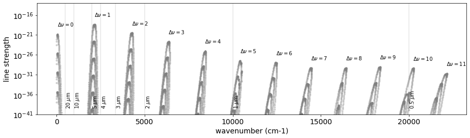
The Rovib transition changes both rotational and vibrational quantum states. We here investigate the vibrational quantum state \(\nu\). Let’s check how many \(\Delta \nu\) Li2015 database contains:
import numpy as np
dv = mdb.df["v_u"]-mdb.df["v_l"]
np.unique(dv.values)
array([ 0, 1, 2, 3, 4, 5, 6, 7, 8, 9, 10, 11])
So, we have 12 different \(\Delta \nu\). Let’s plot them.
import matplotlib.pyplot as plt

fig = plt.figure(figsize=(15, 4))
ax = fig.add_subplot(111)
for i, udv in enumerate(np.unique(dv.values)):
    mask = dv == udv
    mdf = mdb.df[mask]
    ax.plot(mdf["nu_lines"].values,
             mdf["Sij0"].values,
             ".",
             alpha=0.3,
             #alpha=0.01 + 0.005 * i,
             color="gray")
    ax.text(
        np.sum(mdf["nu_lines"].values * mdf["Sij0"].values) /
        np.sum(mdf["Sij0"].values), 1.e2*np.max(mdf["Sij0"].values),"$\\Delta \\nu=$"+str(udv))

for mic in [0.5,1,2,3,4,5,10,20]:
    x = 1.e4/mic
    plt.axvline(x,alpha=0.2,color="gray")
    #plt.text(x,1.e-210,str(mic)+" $\\mu$m",rotation="90")
    plt.text(x,1.e-39,str(mic)+" $\\mu$m",rotation="90")
plt.yscale("log")
plt.ylim(1.e-41,1.e-13)
plt.tick_params(labelsize=14)
plt.xlabel("wavenumber (cm-1)",fontsize=14)
plt.ylabel("line strength",fontsize=14)
plt.savefig("co_dnu.png", bbox_inches="tight", pad_inches=0.1)
plt.show()
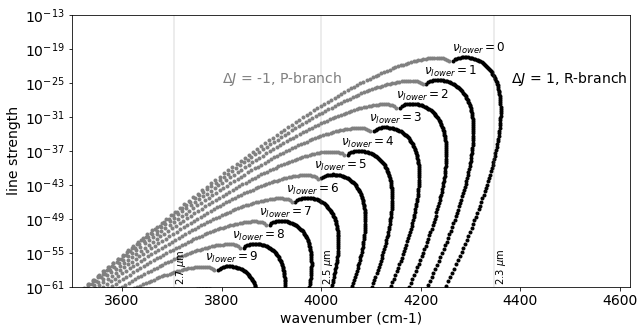
Let’s go deeper! Expand this for \(\Delta \nu=2\) (K-band feature).
dv = mdb.df["v_u"] - mdb.df["v_l"]
dJ = mdb.df["jupper"] - mdb.df["jlower"]

fig = plt.figure(figsize=(10, 5))
for i, vl in enumerate(np.unique(mdb.df["v_l"].values)):
    mask = (dv == 2) * (dJ == 1) * (mdb.df["v_l"] == vl)
    vdf = mdb.df[mask]
    plt.plot(vdf["nu_lines"].values, vdf["Sij0"].values, ".", color="black")
    if i < 10:
        plt.text(np.nanmean(vdf["nu_lines"].values),
                 8 * np.nanmax(vdf["Sij0"].values),
                 "$\\nu_{lower}=$" + str(vl),
                 fontsize=12)
    mask = (dv == 2) * (dJ == -1) * (mdb.df["v_l"] == vl)
    vdf = mdb.df[mask]
    plt.plot(vdf["nu_lines"].values, vdf["Sij0"].values, ".", color="gray")

for mic in [2.3, 2.5, 2.7]:
    x = 1.e4 / mic
    plt.axvline(x, alpha=0.2, color="gray")
    #plt.text(x,1.e-210,str(mic)+" $\\mu$m",rotation="90")
    plt.text(x, 1.e-60, str(mic) + " $\\mu$m", rotation="90")

plt.text(3800.0,
         1.e-25,
         "$\\Delta J$ = -1, P-branch",
         color="gray",
         fontsize=14)
plt.text(4380.0,
         1.e-25,
         "$\\Delta J$ = 1, R-branch",
         color="black",
         fontsize=14)
plt.yscale("log")
plt.ylim(1.e-61, 1.e-13)
plt.xlim(3500, 4620)
plt.tick_params(labelsize=14)
plt.xlabel("wavenumber (cm-1)", fontsize=14)
plt.ylabel("line strength", fontsize=14)
plt.savefig("co_dnu_expand.png", bbox_inches="tight", pad_inches=0.1)
plt.show()
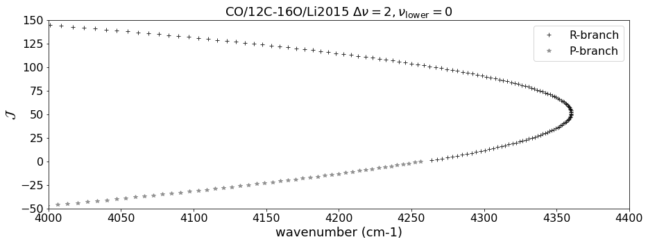
Using DataFrame, we pick up the lines with \(\Delta \nu = 2\), \(\Delta J = \pm 1\) (R, P-branch), and \(\nu = 0\) here.
dv = mdb.df["v_u"]-mdb.df["v_l"]
dJ = mdb.df["jupper"] - mdb.df["jlower"]
vmask = mdb.df["v_l"] == 0
mask_R = (dv == 2) * (dJ == 1) * vmask
mask_P = (dv == 2) * (dJ == -1) * vmask

df_R = mdb.df[mask_R]
df_P = mdb.df[mask_P]
Let’s plot the Fortrat diagram. The y-axis of the Fortart diagram is \(J_\mathrm{upper}\) for R-branch and \(- J_\mathrm{lower}\) for P-branch.
import matplotlib.pyplot as plt
fig = plt.figure(figsize=(15,5))
plt.plot(df_R["nu_lines"].values,df_R["jupper"].values,"+",alpha=0.8, color="black",label="R-branch")
plt.plot(df_P["nu_lines"].values,- df_P["jupper"].values,"*",alpha=0.8, color="gray",label="P-branch")
plt.tick_params(labelsize=16)
plt.xlabel("wavenumber (cm-1)", fontsize=18)
plt.ylabel("$\\mathcal{J}$", fontsize=18)
plt.legend(fontsize=16)
plt.title(emf+" $\\Delta \\nu = 2, \\nu_\\mathrm{lower} = 0$",fontsize=18)
plt.xlim(4000.,4400)
plt.ylim(-50,150)
plt.savefig("fortrat.png",  bbox_inches="tight", pad_inches=0.1)
plt.show()